Designing a nursery can be exciting but it can also be overwhelming. Do you start with the crib then go from there? Do you pick the paint first? Do you just pick a theme and get everything related to that and hope that it all goes together?
One of the best ways to figure out a theme for any room is to start with the art.
Not only does it establish a large focal point in the room but it gives you cues for colors, textures, and decor elements to tie into it. To show you what I mean I've pulled together a bunch of nurseries that use art as a starting point.
Even though all of the spaces have a theme, the elements don't necessarily reflect that. For instance, if you land on a rainbow theme for your nursery everything in the room doesn't have to be rainbows. In fact, adding solid colors and textures will highlight the rainbows you do have.
I've also made a point to use affordable pieces in the room to demonstrate how you can design around a single point even if you're on a budget.
Here's what I mean about designing a nursery around art:
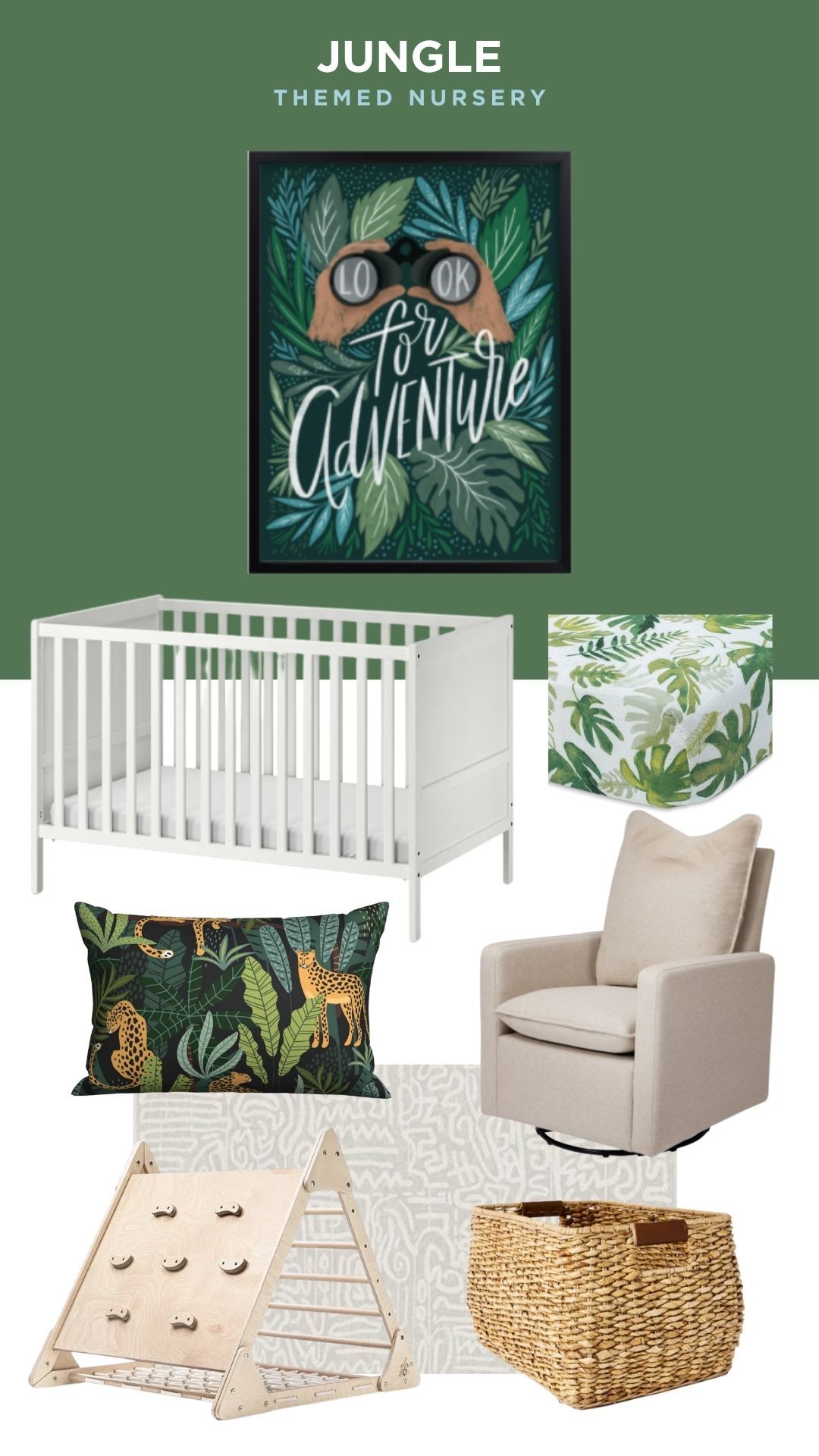
Jungle theme nursery
I wanted to start with an example that doesn't use art that's too on the nose - this adventure print could be used in a forest theme just as easily. That said, I'm an animal nerd who takes themes literally and won't put a giraffe in a jungle-themed nursery (even though it looked really good in this graphic). I tried to use neutrals on the larger items like the glider and the Keith Haring rug (it's washable too) so you could use it in other spaces as your child grows up.
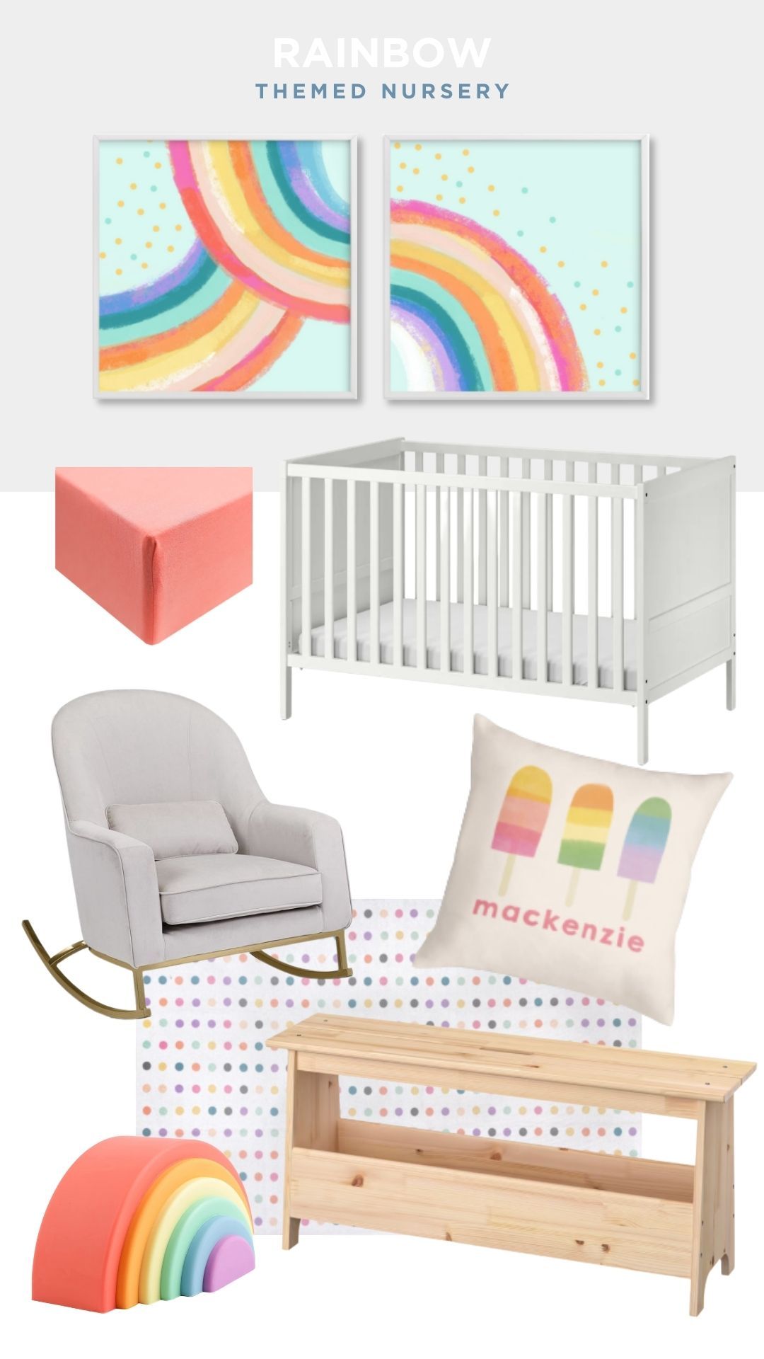
Rainbow themed nursery
At first, I was tempted to go with something bright on the walls but I decided to keep the elements fairly neutral so the rainbows could shine. It also means you can use the rocker, crib, and even the rug in a different theme or room down the road. I wanted it to be more of a soft sunshower rainbow feel vs. a lucky charms explosion but, frankly, I could see that being fun too.
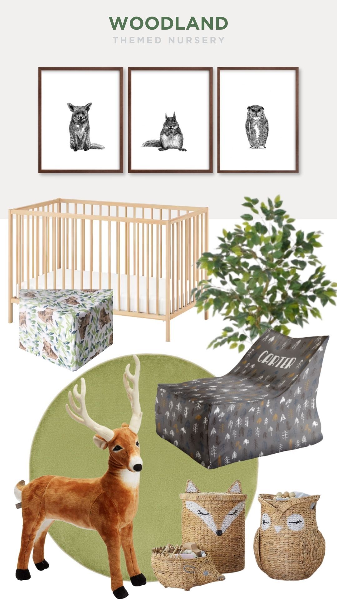
Woodland theme nursery
I loved these woodland creature prints because they are more mature than the average woodland nursery art. They could easily work in an older kid's room without feeling like it's a baby holdover. I found these $20,000 rugs made by an incredible artist Alexandra Kehayoglou but felt that the cool green round rug from Target was a better choice when you're going to play the "poo or chocolate" game for the next five years.
Note: the tree in the example is fake. Real ficus is toxic so skip it if it's within reach of kids. If you want something real, parlor palm (Chamaedorea elegans) is a better choice. It's non-toxic and doesn't need too much watering.
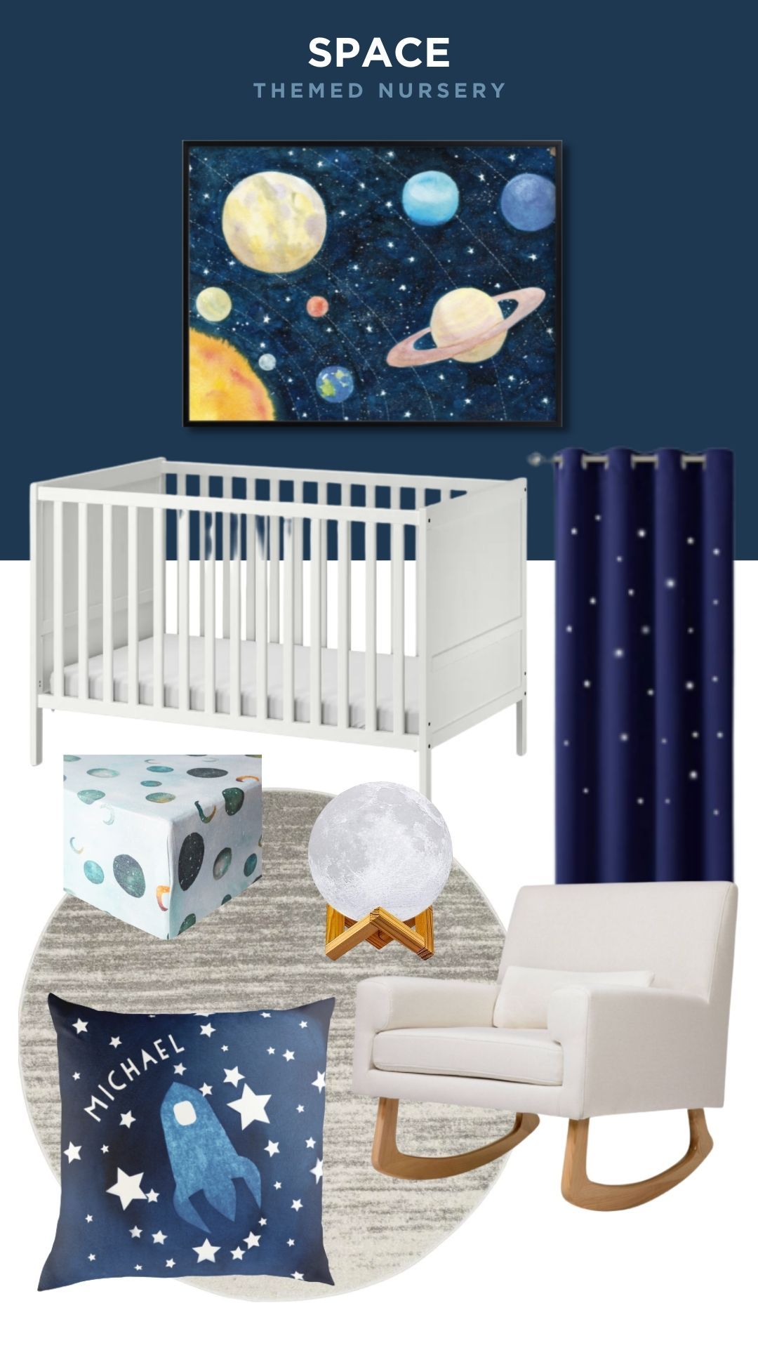
Space themed nursery
Here's a theme where you could go absolutely nuts with but I tried to show a little constraint even though it was difficult. I thought the space print was tasteful and stuck a nice balance between planets and stars. The curtains have cut out stars so they glow if it's light out and I couldn't resist the moon night light. I thought the area rug had a bit of a Jupiter vibe but that's my nerd leanings showing again.
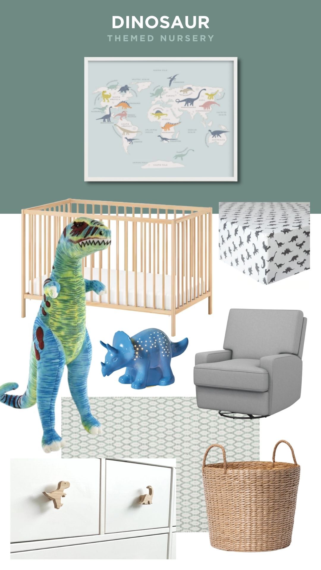
Dinosaur themed nursery
Here's another theme where I wanted the details to reflect 'dinosaur' more than the large elements. I love that the print has an educational element to it and wouldn't look out of place on an older child's wall. There are plenty of amazing dinosaur rugs out there but I picked one that could be used a little longer and had a nice texture (had a 'scales' feel to me). The drawer pulls could easily be swapped out if you redecorate down the road.
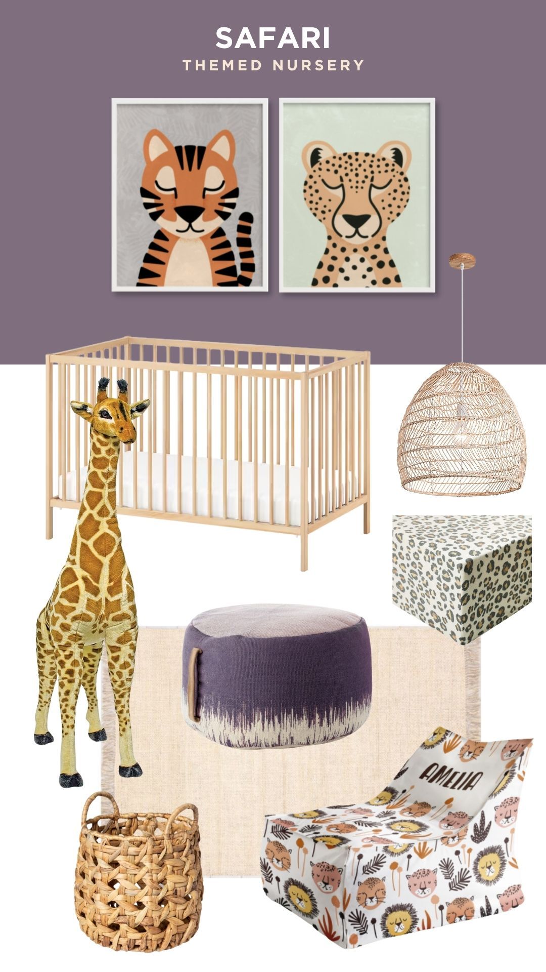
Safari themed nursery
Finally, I got to use my giraffe!! I liked bringing the look of savannah grass elements in here with the basket, pedant light, and rug. The animal prints gave me the idea for the plum color which gives a contrast to the warm yellows. Did I get hung up on the tiger print? Yes. Did I spend way too long looking at the range of the natural habitat of tigers and then decide that I should donate money for their preservation rather than hand wringing about their decor accuracy. Also yes.
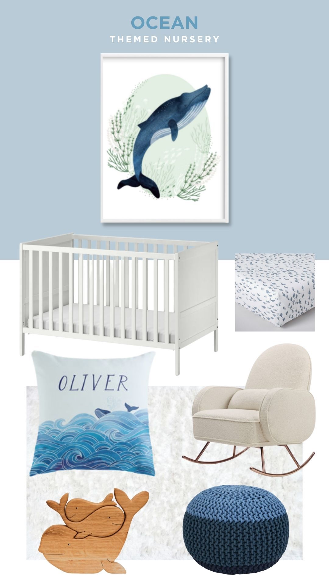
Ocean themed nursery
Ocean themes are a slippery slope because it can mean sea creatures, beach, and nautical elements. I decided to stick with the water, whale, and waves vibe because it feels very soothing. I love how the whale print has blue and sea green elements to it so you have a few color options to pull from.
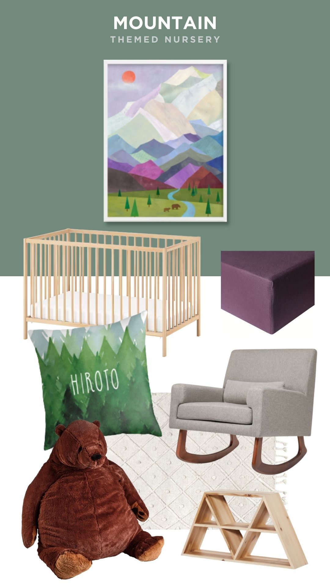
Mountain themed nursery
Mountain themed nurseries are often very gray so when I saw this colorful mountain artwork I thought it would be a great starting point. Not only did it help with the color cues of rich green and plums, but it had a nice triangle tie in. Also, when I saw the bear in the print I knew a giant bear was in order. I originally had a large standing bear in here but it looked a little scary so I opted for this rolly polly fella.
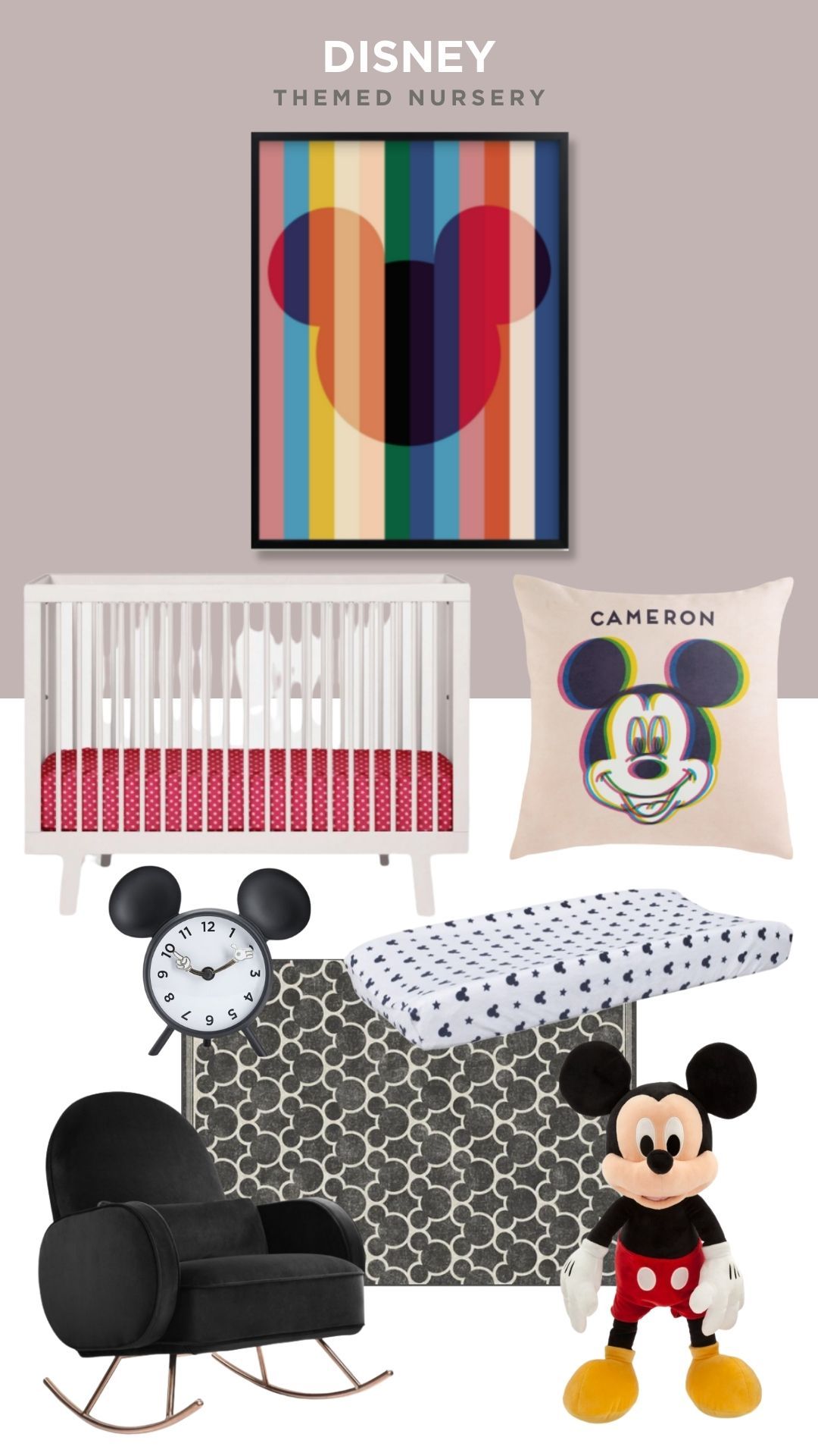
Disney themed nursery
There are so many ways you can go when it comes to Disney but I loved this graphic Disney print so much that I decided to go full old-school Mickey. I love how the chair isn't Disney but has a bit of a mouse ear vibe and that Mickey Mouse carpet isn't just tasteful, it's machine washable – “That sure is swell!”
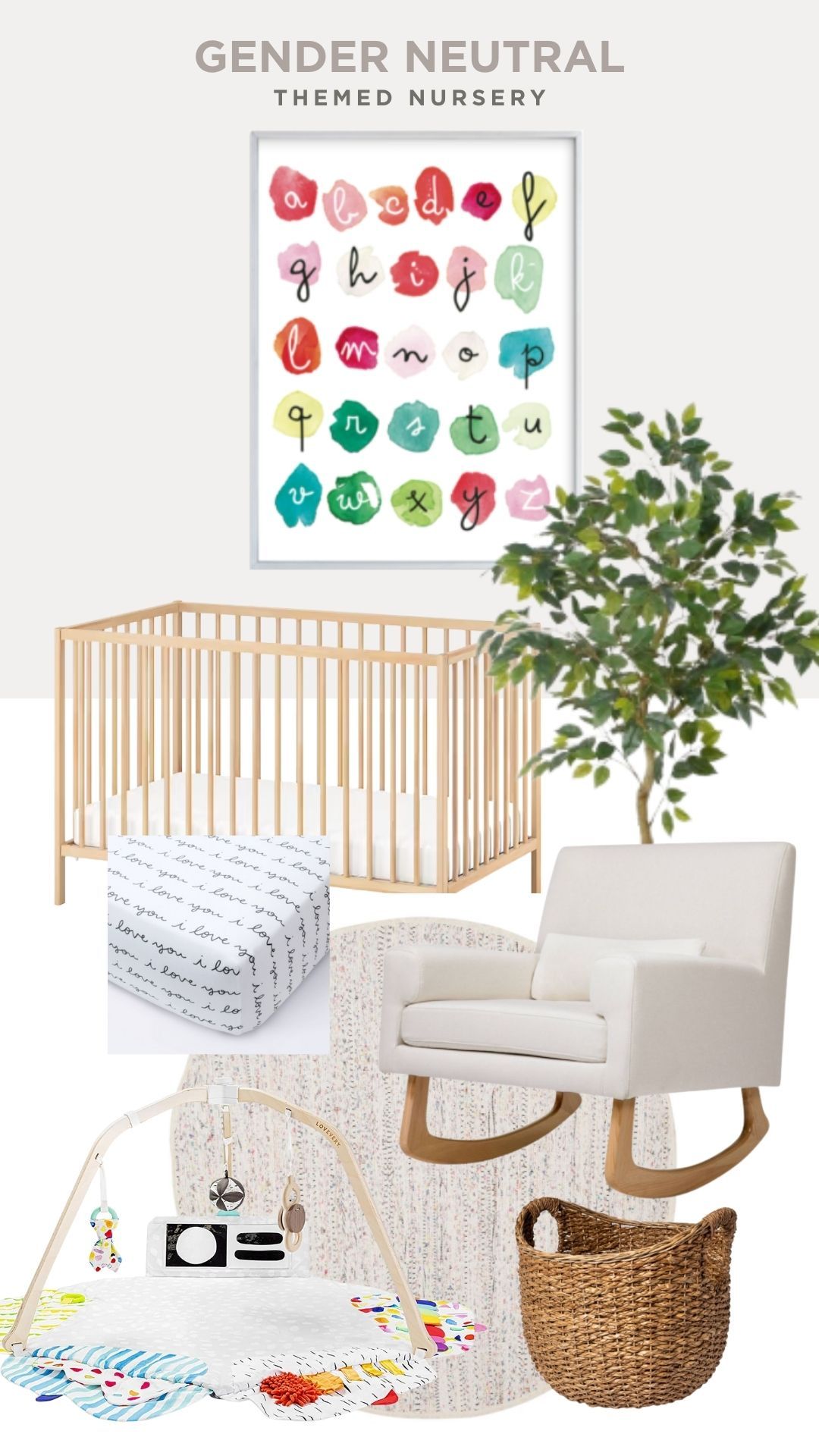
Gender Neutral themed nursery
Let me start by saying no room has a gender. As you can see from my comments above, I would have LOVED a dinosaur or spaced themed room as a child. But if you're looking to create a calm space that appeals to almost anyone, starting with a bright print like the alphabet watercolor print then surrounding it with neutrals is a great place to start. The cool play gym is from Lovevery and you can read our review on it here.
In summary
Using art as a starting point for these nursery themes was so much fun to put together. (Even if I did spend waaay too much time researching moon surface texture and the natural habitat of tigers.) Hopefully, it inspires you to create a beautiful space of your own! Feel free to tag me @pregnantchicken on Instagram if you want to share your nursery design with me. I'd love to see it!
You might also like: Best Baby Registries (That are also easy to use)


Leave a Comment